Payment Acceptance Mark Myth
A Payment Acceptance Mark, as the name suggests, is a symbol that informs users in payment scenarios that a specific payment method is accepted. This concept took shape alongside the development of the bank card industry, gradually becoming one of the key vehicles for major banks and card networks to showcase their brands and drive payment adoption. For them, users need to be educated to understand "see the acceptance mark, pay with it."
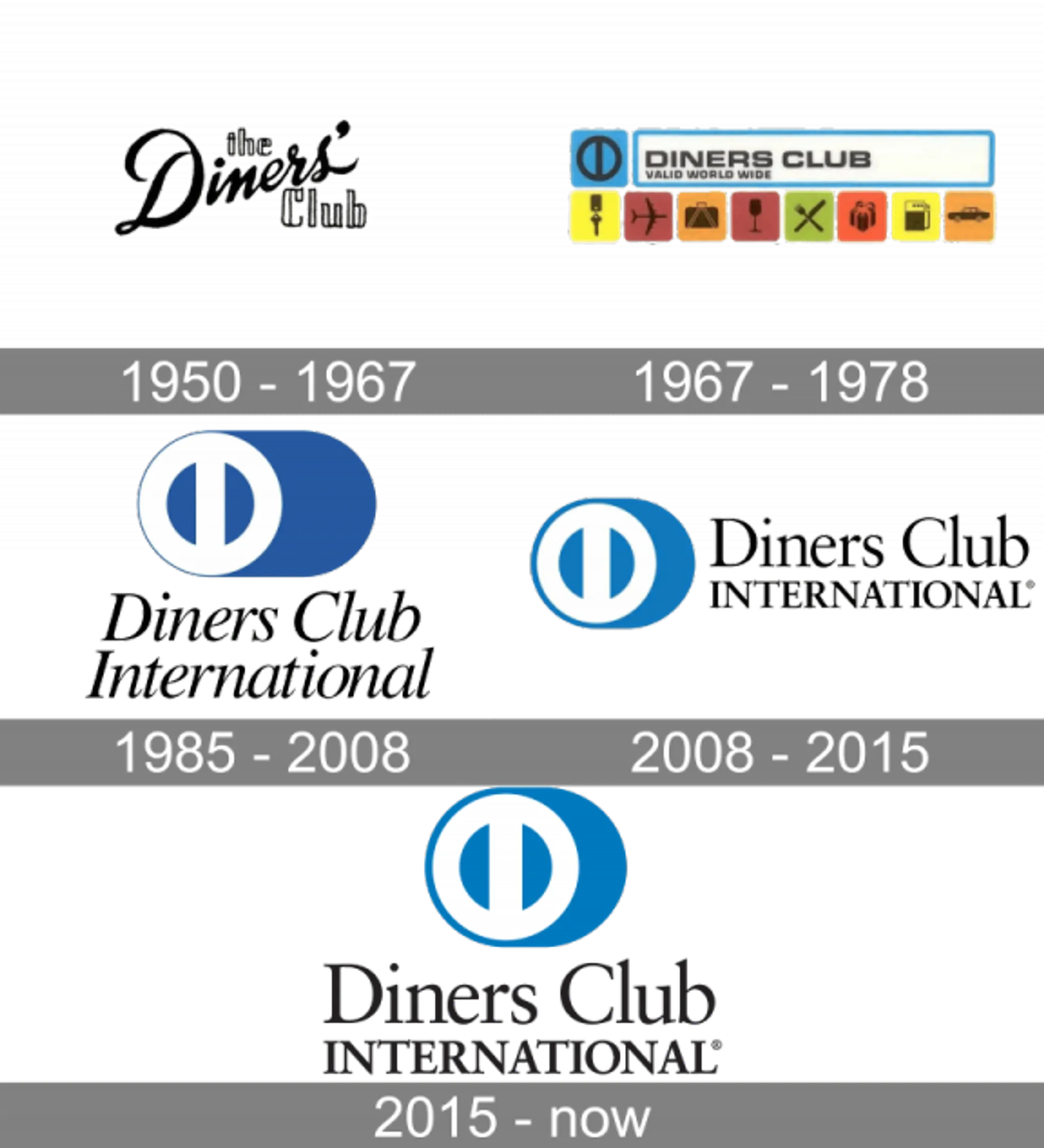
The Earliest Acceptance Marks
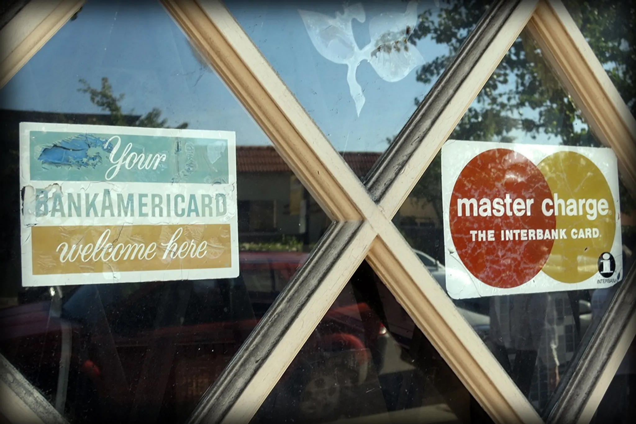
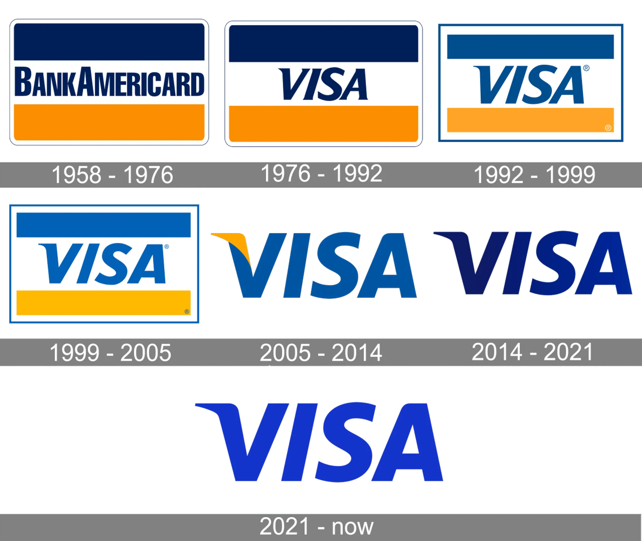
The concept and terminology of payment acceptance marks appeared quite late — even now, "Acceptance Mark" isn't a widely established industry term. However, the thing itself appeared much earlier. In the image below, we can see that when VISA was still called BankAmericard (before 1977) and MasterCard was still called Master Charge (before 1979), they were already posting logos at brick-and-mortar store entrances to attract customers.
Acceptance Marks and Branding
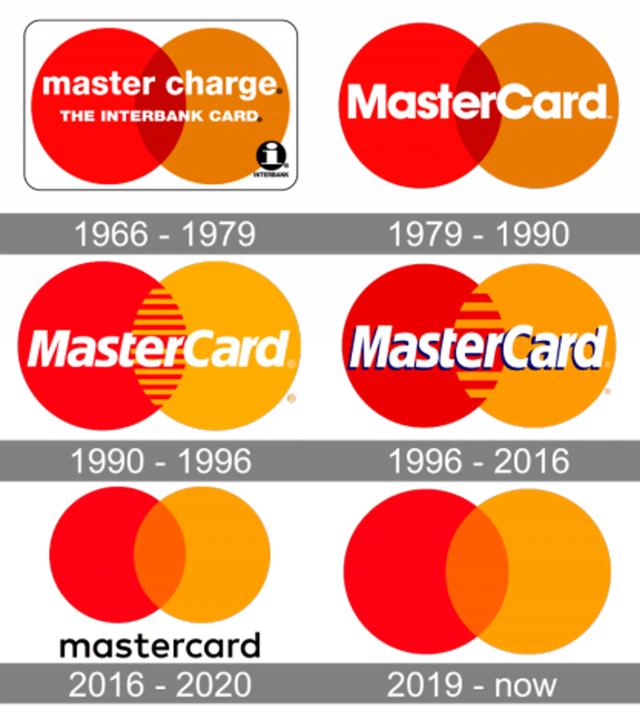
Among these, MasterCard has been particularly dedicated. Its latest 2019 brand identity was designed by the globally renowned design firm Pentagram, commissioned at a cost of $8 million: MasterCard Brand Design | Pentagram
The Digitization Dilemma
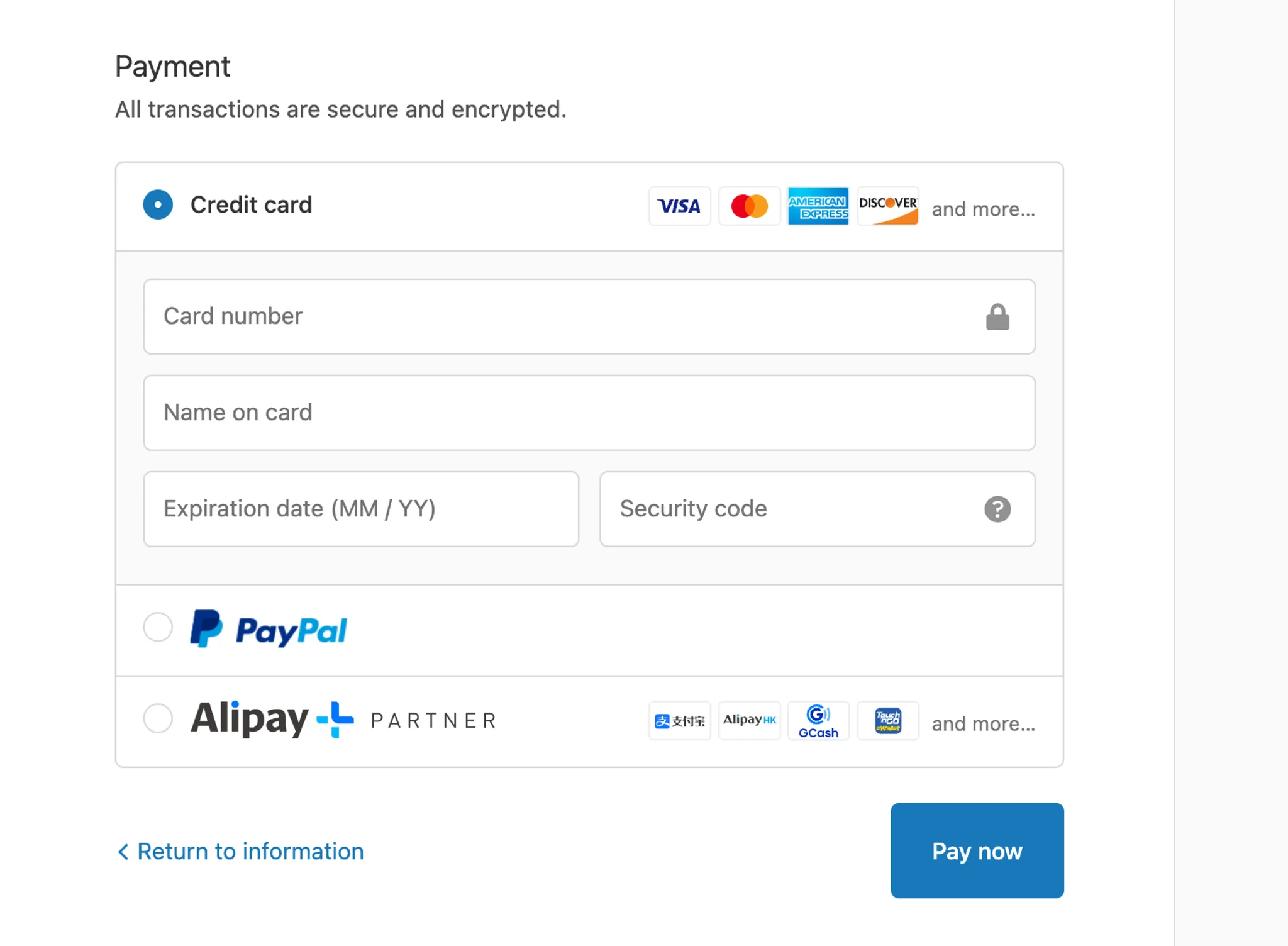
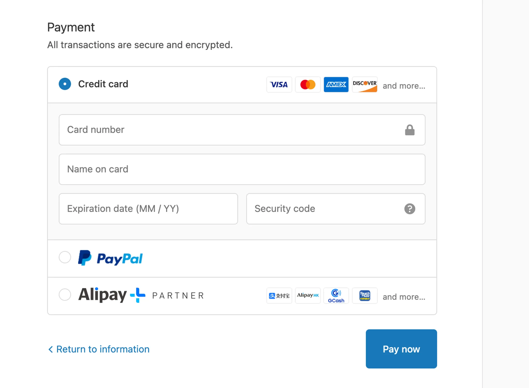
With the digitization of payments and the rise of e-commerce, acceptance marks now face challenges from web and mobile interfaces. Unlike offline scenarios with an entire glass storefront and counter, online real estate is precious. How to clearly display acceptance marks within limited page containers has become a challenge. Some have made big sacrifices — like MasterCard's latest brand dropping its wordmark entirely, or American Express sacrificing its full brand name so consumers can instantly recognize it as AMEX:

It's worth noting that American Express's latest brand design was also by Pentagram: AMEX Brand Design | Pentagram
By comparison, we can see that the new acceptance marks are indeed more readable in online payment scenarios:
(Note: Pentagram has been involved in brand design for almost all major financial institutions in North America, while charging extremely high fees. Portfolio)
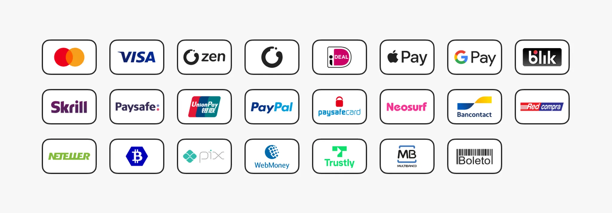
The Digital Era Free-for-All
With more and more digital wallets launching, acceptance marks have proliferated. There are currently over 300 identifiable electronic payment platforms worldwide, each with different acceptance marks, causing significant confusion in the payment industry. In the early days, all acceptance marks were maintained manually and distributed physically, so issuer brand updates couldn't promptly reach the front lines. For example, PayPal's Logo Center still uses the most outdated Visa and MasterCard acceptance mark assets (zero points for their sales team!):
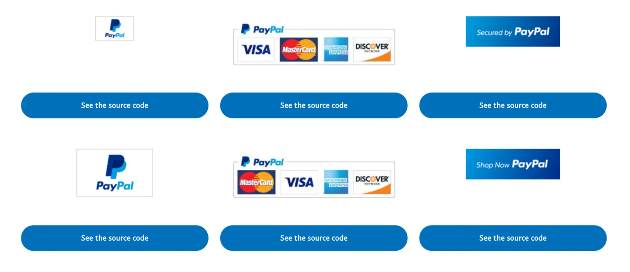
Visit the Logo Center: PayPal Logo Center
Various platforms have tried creative solutions to this problem. Take Shopify as an example — they maintain an open-source acceptance mark library on GitHub to support all Shopify merchants worldwide in rendering their respective payment methods. They have dedicated reviewers who audit all kinds of "payment icons" globally and strictly enforce design specifications for all acceptance marks. (Alipay+ also maintains their in-network wallets there.) Currently, Shopify maintains 355 open-source payment acceptance marks.
View all marks maintained by this project: Shopify Payment Icon Open Source Library
Summary: Acceptance Mark Design Principles
- Content should be clearly visible and suitable for small container display
- Single color tone with vivid colors; or clearly contrasting color block combinations
- Include clear brand element information
Some Common Acceptance Marks
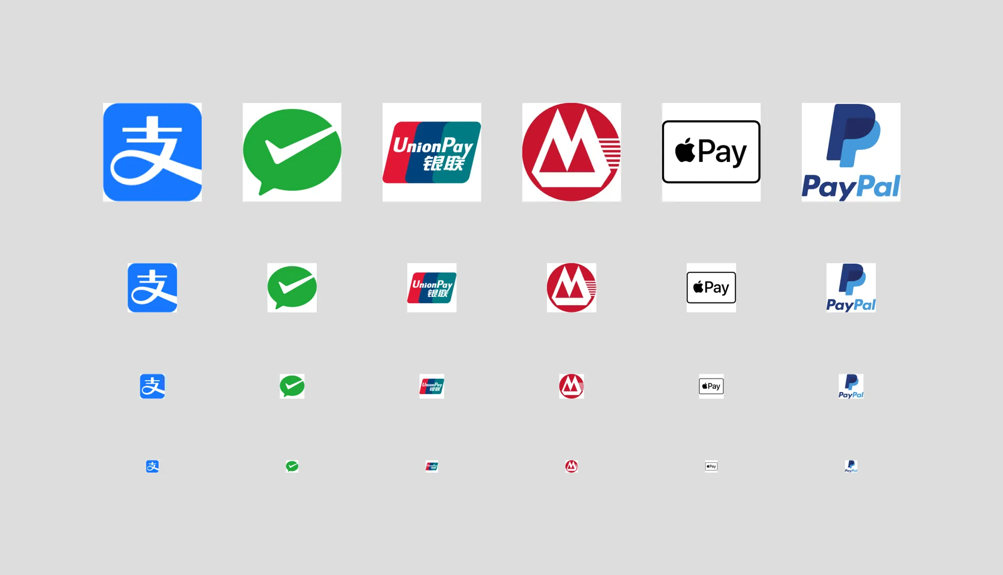
So, among the common payment methods in mainland China, the acceptance mark designs are generally acceptable. Alipay's is the best — the representation of the "支" character and the eye-catching blue color allow users to quickly identify Alipay. WeChat Pay's issue is that its mark doesn't inherently convey WeChat's brand elements. PayPal's current brand guidelines require the PayPal wordmark to be visible, so its acceptance mark has lower recognizability in small containers.
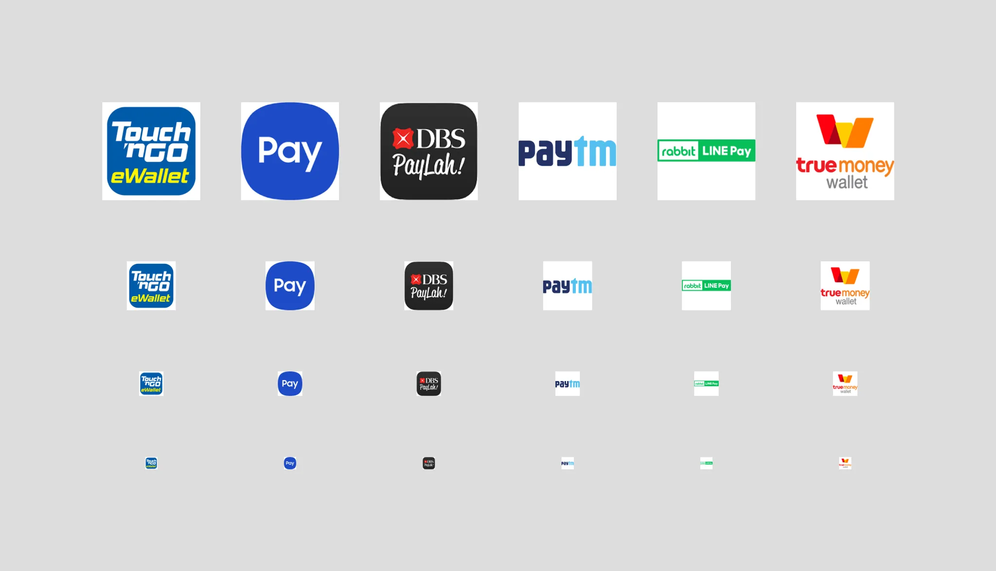
Some less-than-ideal examples from around the world (from left to right: Touch 'n Go eWallet, Samsung Pay, DBS PayLah, Paytm, Rabbit LINE Pay, TrueMoney Wallet)